Here are the three primary colours – red, blue and yellow. I
have been thinking about colour a lot this summer. It all started on holiday in
St Ives when we were surrounded by vibrant summer colours – deep blue sea and sky,
yellow sand and multi-coloured seaside paraphernalia – things like umbrellas,
bikinis and beach towels. Also we visited the Tate Gallery and I bought a book
about an artist called Winifred Nicholson called ‘Music of Colour’. Winifred
painted from the 1920s through to the 1970s and she painted flowers a lot. She
also wrote about colour:
'Flowers create colours out
of the light of the sun, refracted by the rainbow prism. So I paint
flowers……The flowers are sparks of light, built of and thrown out into the air
as rainbows are thrown, in an arc.’
This is the heart of it – the perception of
colour is created by the reflection of light received by our eyes. The full
range of colours can be seen in rainbows. Books about art and photography
usually depict the relationship between different colours in the shape of a
circle – often called the colour wheel.
I have shown it here with small jars of flowers.
The circle shows how new colours are mixed from the three
primary colours. When creating flower arrangements colours can be used in many
different ways. I like to work with analogous colours – these are
colours which lie next to each other on the colour wheel – like these yellows
and oranges (I am including some green here as well because I generally add
some foliage to my arrangements and I see it as being neutral in flower
arrangements).
Yellows, reds and oranges are called ‘warm’ or even ‘hot’
colours, not just because we associate them with sun, heat and fire but because
they are vivid and energetic and they seem to advance towards us when we look
at them . Here are some examples of arrangements using these colours. The flat arrangement below is a funeral sheaf, but these bright colours celebrate a life well lived rather than a sad loss.
My favourite colours are the analogous colours that reside
around blue – blue itself, blue-violet, red-violet and even a bit of red or
pink (but no yellow, except perhaps the centre of a daisy or a cosmos bloom).
My portfolio is full of arrangements using these colours.
Here are some bridesmaids posies and flowers for a wedding reception.
And here are some examples from just a few days ago when I
was demonstrating a couple of ways of making arrangements (hand-tying and using
chicken wire) to a group of ladies from WIs in the Peak District.
Complementary colour schemes use two colours that lie approximately
opposite each other on the colour wheel. For example, blue and orange. This is an unusual, but really effective combination. The arrangement in the blue jug is made from fair trade roses and clary sage which I grew very successfully in our garden this year (oh...and there are a few of our Sheffield-grown apricots!)..
Or, yellow and violet. This is a combination that I really like. The arrangement below is made from fair trade roses and flowers from our garden - verbena bonariensis, sweet peas and self set fennel.
The high contrast of complementary colours is exciting to
the eye and more striking than analogous colours. But
often I want to create a more muted, gentler effect. Black, grey and white are achromatic (without
colour) and they all work in a neutral way with flowers to set off or enhance
colour. This can be in the form of vases, or as white flowers which lighten the impact of
an arrangement. I tend to use a lot of white in wedding arrangements, like this
bridal bouquet.
The wedding circlet below used muted colours – light pink sweet william,
grey-blue lavender and sea holly and white avalanche roses. It was placed
against a neutral grey wall and I think the whole effect is really lovely –
soft and romantic.
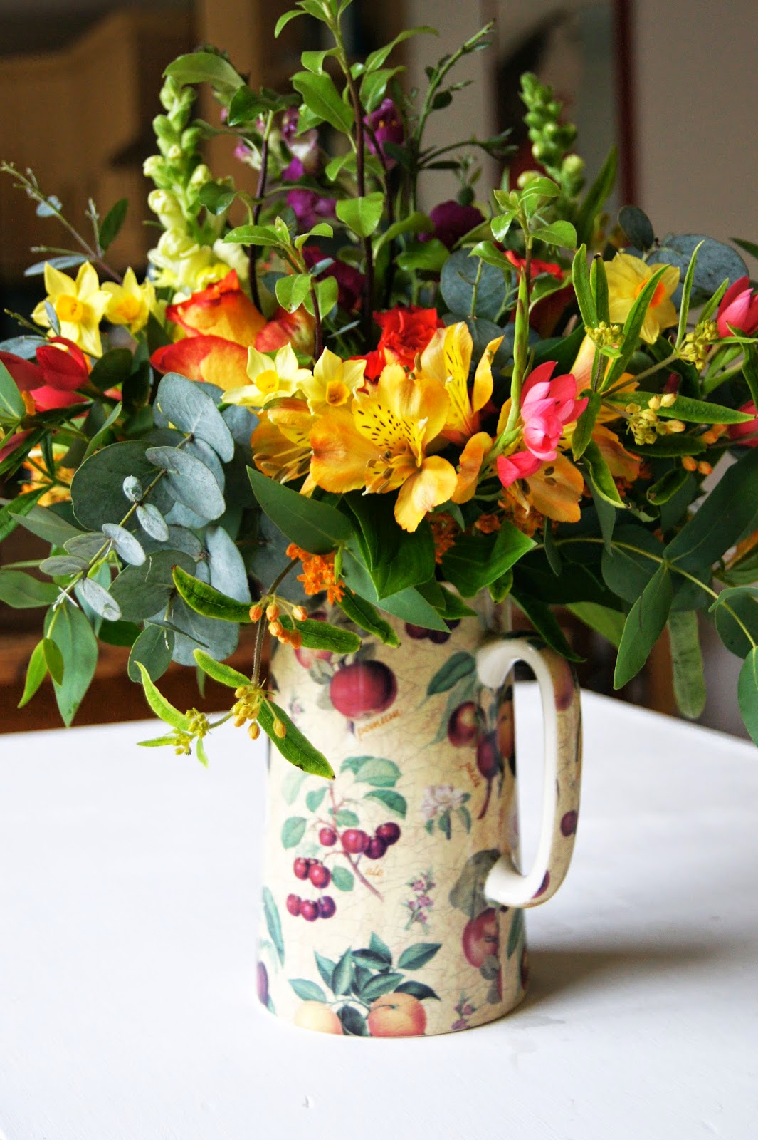
I will finish with a wonderful burst of colour. It was my
birthday last month and I was given this exuberant arrangement by Aunty Joan. I
placed it on top of a table runner which I had put in place for my party. It just
happened to use the same colours as Joan’s arrangement. I had made simple jam jar arrangements in
white and green – the colour in Joan’s arrangement brought
these to zingy life. What a fantastic birthday present!


